
Crest Hardware
Creating an e-commerce experience for a local hardware store.
Family-owned shop Crest Hardware, based in Williamsburg, Brooklyn, boasts an extensive selection of hardware and home goods, as well as a large selection of indoor and outdoor plants. Because the Covid-19 pandemic has limited in-store shopping and Crest’s website does not host online shopping, I conducted research, analyzed trends, and built from Crest’s existing branding and web presence to design and implement a seamless e-commerce experience for users.
Project Background
Team
Gabby Coll, User Research & User Experience Design
Sprint
Two weeks; October 2021
Research
I developed a research plan which included user interviews, comparative and competitive analysis, feature inventory, task analysis, affinity mapping, usability testing, and card sorting which informed the design and implementation of the project’s elements.
Design
Research informed the design process to create a persona, problem statement, user flows, information architecture, sketching, wireframes, and prototyping.
Tools
Figma, Photoshop, Miro, Optimal Workshop
RESEARCH: DISCOVER & EMPATHIZE
To start the research phase, I took a look at Crest’s existing website and conducted comparative and competitive analysis with competing brands. Crest’s original website is clean and, for the most part, well-organized. The site features large and colorful photos, an engaging video tour of their physical shop, and streamlined branding with their logo’s signature red. I found some redundancies in some of the content, as well as important content featured on the home page but not in the global navigation (such as the product browsing page).
First, what the existing website looks like:


Comparative and Competitive Analysis
Based on what my user interviewees said, the direct competitors of local hardware shops are Home Depot, Amazon, and Ace Hardware. I did some research about their website features and the ease of checkout flows.

Task Analysis
How many steps did it take to check out on each competitor's site?
14
Amazon
Happy checkout flow. Information auto-populated for existing Amazon member.
48
Home Depot
Sad checkout flow. Required the creation of an account to checkout.
28
Ace Hardware
Medium checkout flow. Some areas autofilled. Did not require account for checkout.
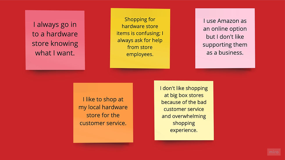
Human input: Interviews and Affinity Mapping
5 user interviews
Between the ages of 25 and 35
Frequent shoppers at local hardware stores
Apartment renters or young homeowners in mid-size urban areas
Interviewed about their hardware and online shopping habits
Key interview takeaways:
All users shop for hardware store goods almost exclusively in person (online orders only for in-store pickup).
Most users prefer local hardware stores to support local businesses and because the customer service is much better.
Moral qualms are also a factor across the board: users don’t like supporting big box stores (Home Depot, Amazon, etc.) but will resort to them when items aren’t available at their local stores.
Online shopping habits vary, but universally users expect free and fast shipping and an easy checkout flow.
DEFINE: PERSONAS
With the information gathered from user interviews, I created a user persona to represent our target audience. Later, this user persona will guide the creation of user flows to represent their usage of the newly designed e-commerce experience.


Problem & Solution Statements
Problem Statement
Crest Hardware needs an online store to increase revenue and build and maintain customer loyalty.
How Might We?
How might we create a seamless e-commerce experience for existing shoppers at Crest Hardware to shop online as well as in-person?
Solution
Using insights from user and market research, we will design and prototype a seamless and user-centered e-commerce experience for online customers of Crest Hardware.
Card Sorting
KEY TAKEAWAYS:
Almost everyone categorizes hardware store items differently
Analyzed main categories and then divided by subcategories to create e-commerce menu
10 users
Open sort
Blind tested

Object sample in Optimal Workshop
IDEATE AND DESIGN
All of the information gathered from research - user behaviors, challenges, comparative and competitive analysis, card sorting, and affinity mapping - informed the ideation process to create user flows and wireframes.


PROTOTYPE & TEST
After creating a first prototype, I conducted 3 usability tests moderated and recorded via Zoom. These were the goals while testing:
TASKS:
Search for and find a birdhouse product page
Purchase a Dewalt Circular Saw for pickup in-store
Enter a query in the Contact Us form on the website
TESTING GOALS:
Users will be able to complete the checkout flow in under 3 minutes
Users will be able to find and submit a contact form with 0 or 1 errors.
Users will be able to purchase a circular saw in under 3 minutes
TESTING RESULTS
Overall flows were straightforward
The biggest challenge for users was that users didn’t click the search function for flow 2 - product discovery.
TESTING GOAL RESULTS:
Average time to complete product discovery task: 57 seconds
Average time to complete product purchase: 2 minutes, 8 seconds
All users were able to submit contact forms with zero errors
2/3 users were able to purchase a circular saw in under 3 minutes

FINAL TAKEAWAYS
Because of the limited scope of this project, I was only able to implement one round of user testing iterations. From this feedback I made these main changes to my designs:
The plus and minus signs to open the collapsible sections in the checkout flow were hard to click; i made the whole area of each section clickable
The “add to cart” plus sign button popped up the checkout flow which was confusing
Next steps: prototype and design the menu dropdown flow for the product discovery.